BLOG / POSTS
Text Expansion and Contraction in Mobile Apps
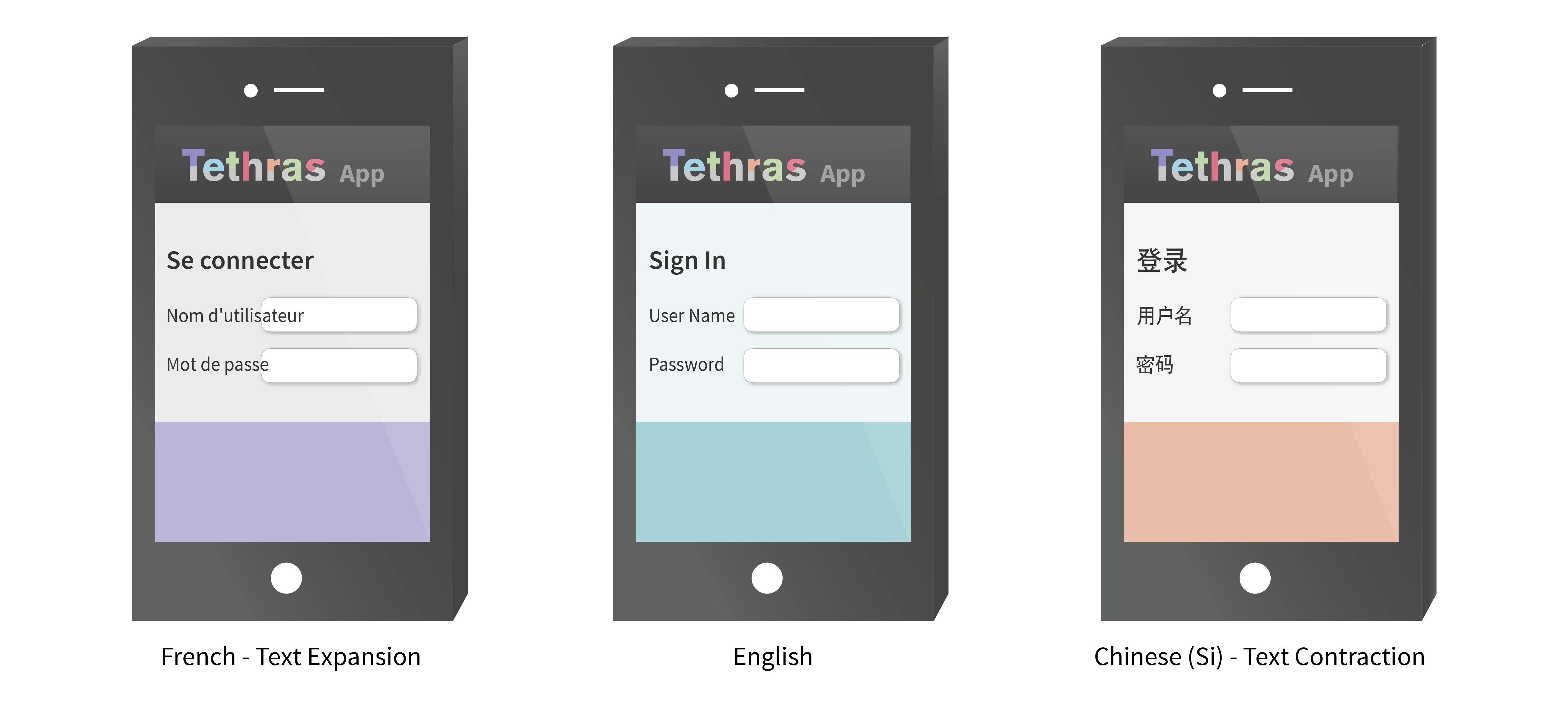
Post-translation text expansion and contraction can significantly impact on the end quality of your localized Mobile app. With text sometimes expanding by more than 33%, UI elements struggle for valuable screen space. Alternatively, significant text contraction can render the UI ‘Clunky’ with excessive white space and loss of symmetry. Careful choice and layout of the UI elements can significantly reduce the negative effects of expansion and contraction.

To optimize UI elements for expansion and contraction of text, some measure of these effects is required. As the source content can have a large effect on the degree of expansion and contraction, we have analyzed thousands of strings across 30 apps and generated mobile-specific text expansion and contraction data for the more common language regions.

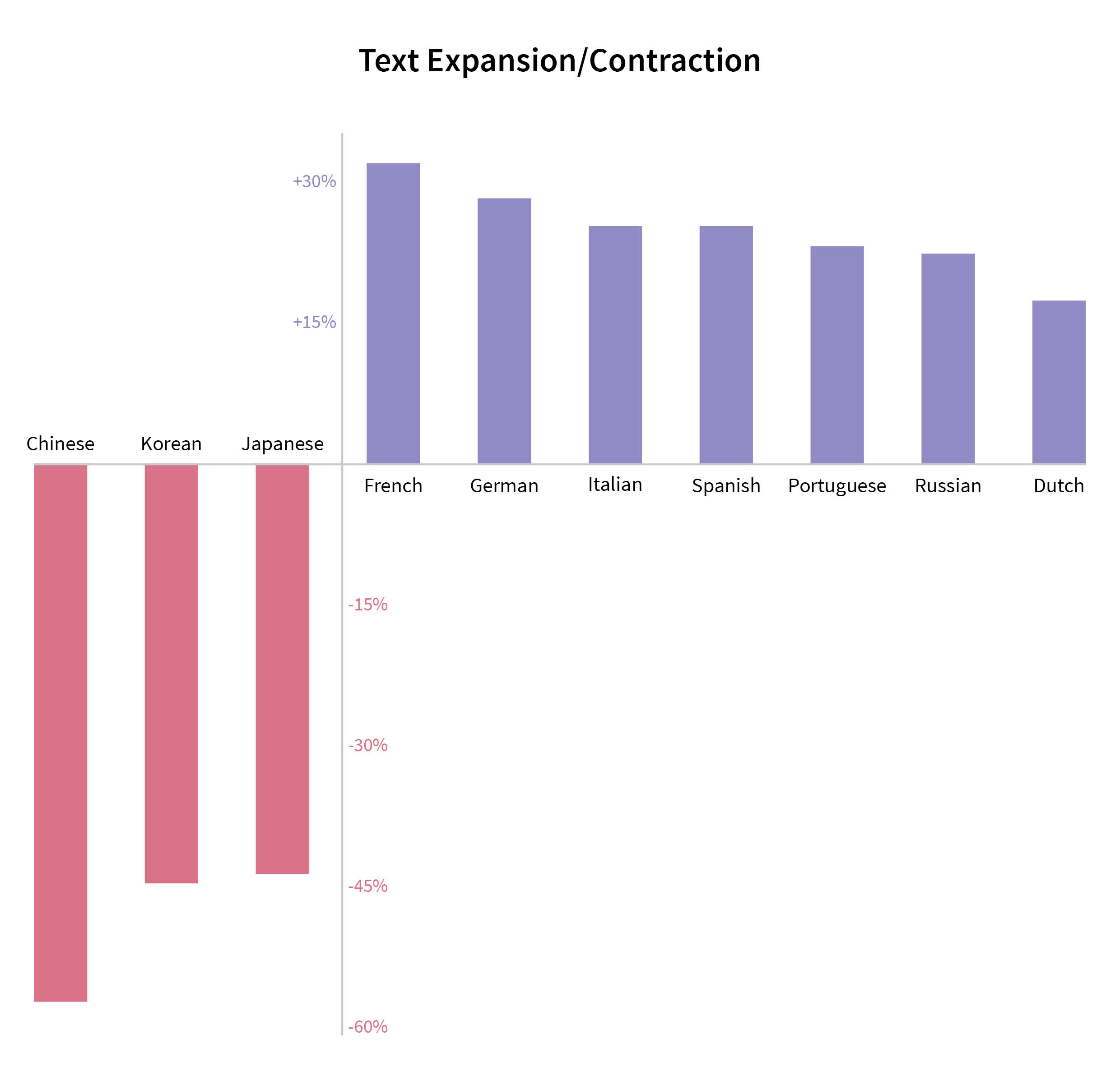
Results for expansion and contraction of text in different languages are displayed above, with maximum expansion of 33% for French and contraction for all three of the Asian languages. By concentrating our analysis on .strings, we have focused on UI text rather than verbose marketing text, or help stacks.
As can be seen from the data above, it is worth building a version of your app with 30% expansion and 30%-40% contraction to test the effects on your UI. Although iOS, Android and Windows Phone 8 apps, all handle expansion and contraction in different ways, creating sample builds with expanded and contracted text is the best way of checking your layout prior to full localization.
Check out Video 4 on how to Pseudo localize your app for text expansion.